What exists
The product
Every screen in the running demo, what it does, and what is a placeholder.
This is the demo - version zero. It runs, it stores everything on the device, it calls no service and it has no account. The screenshots below are that build, at the three widths it is designed for.
Where something is a placeholder, it says so on the screen and it says so here.
Home
The two questions that come before opening the wardrobe: what is the weather, and what is happening today.
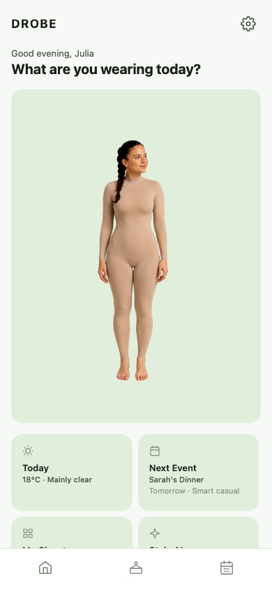
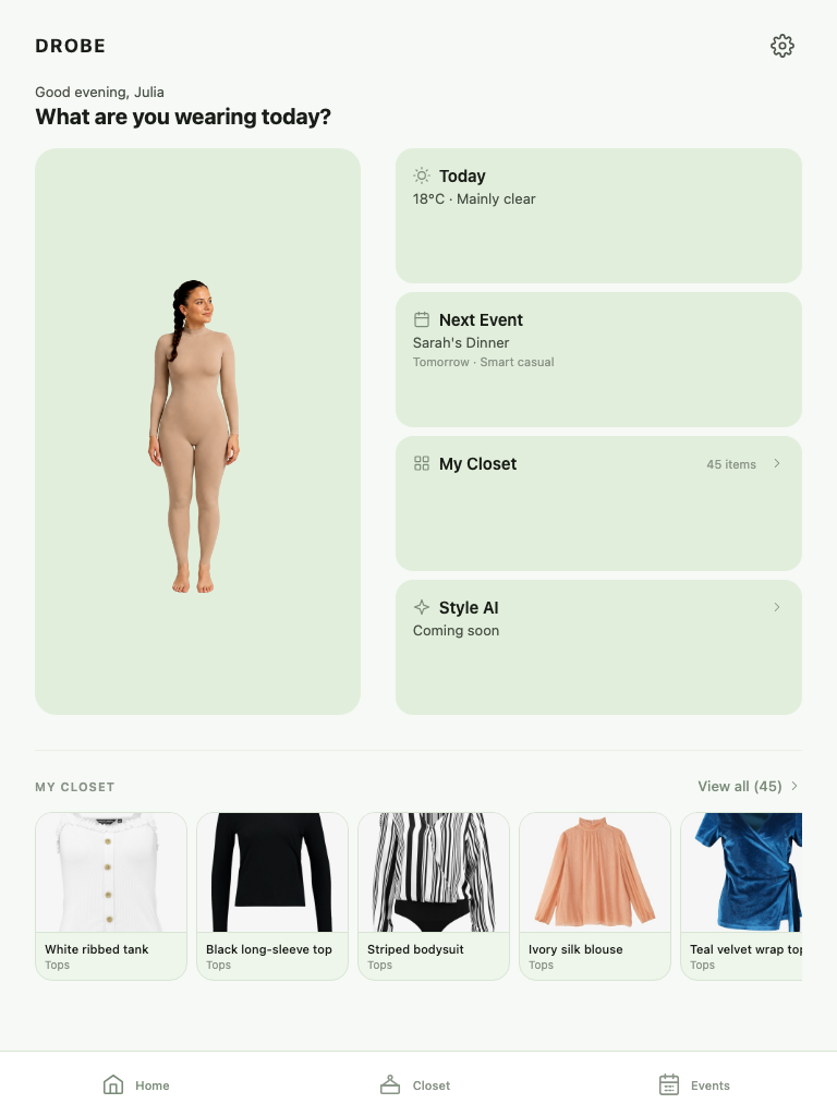
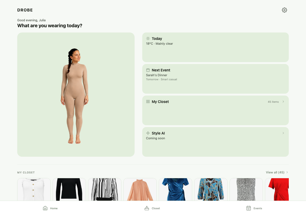
The avatar fills the left panel. Beside it: today’s temperature and conditions, the next event with its dress code, the closet with a count, and the stylist. Below, a horizontal strip of the wardrobe.
The avatar is a photograph standing in for the generated one. Weather is live - Open-Meteo, no key, cached locally.
Closet
The whole wardrobe as photographs, two to four columns depending on width, with category filters across the top.
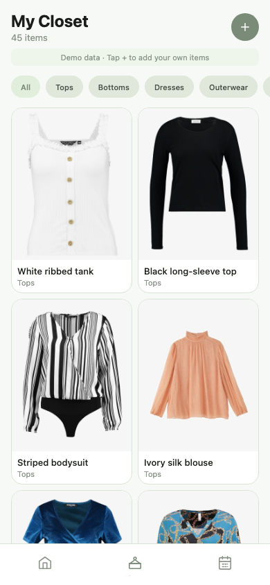
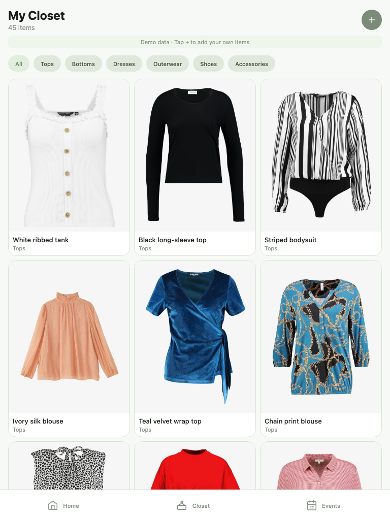
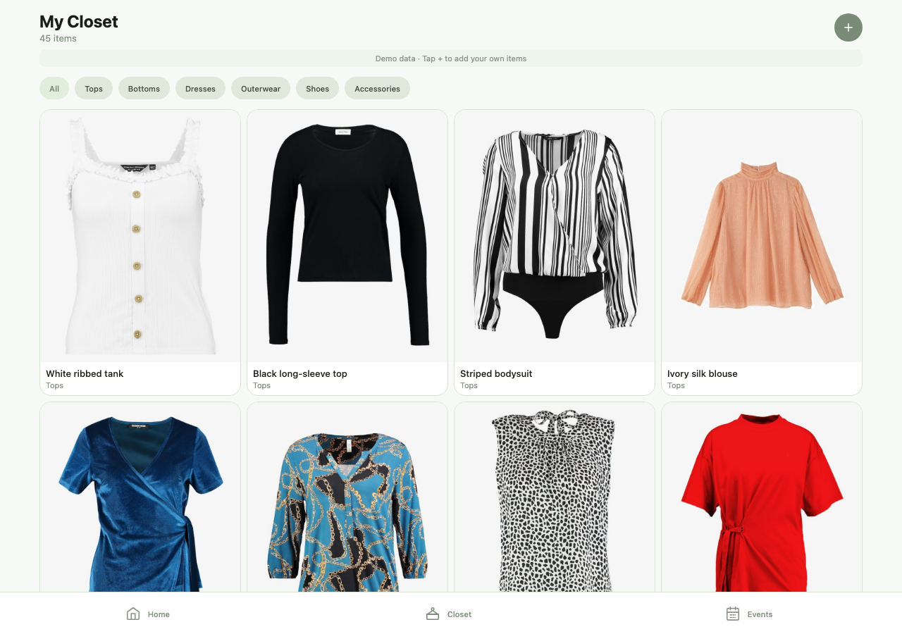
Forty-seven seed items so the app is populated on first launch. Filters for Tops, Bottoms, Dresses, Outerwear, Shoes and Accessories. Adding an item exists: the camera captures a photo and it is stored on the device.
Two items have real try-on results, generated once and bundled.
Events
The calendar, the weather for the selected day, and the events ahead - each with a dress code and a slot to plan an outfit against.
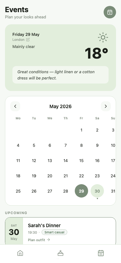
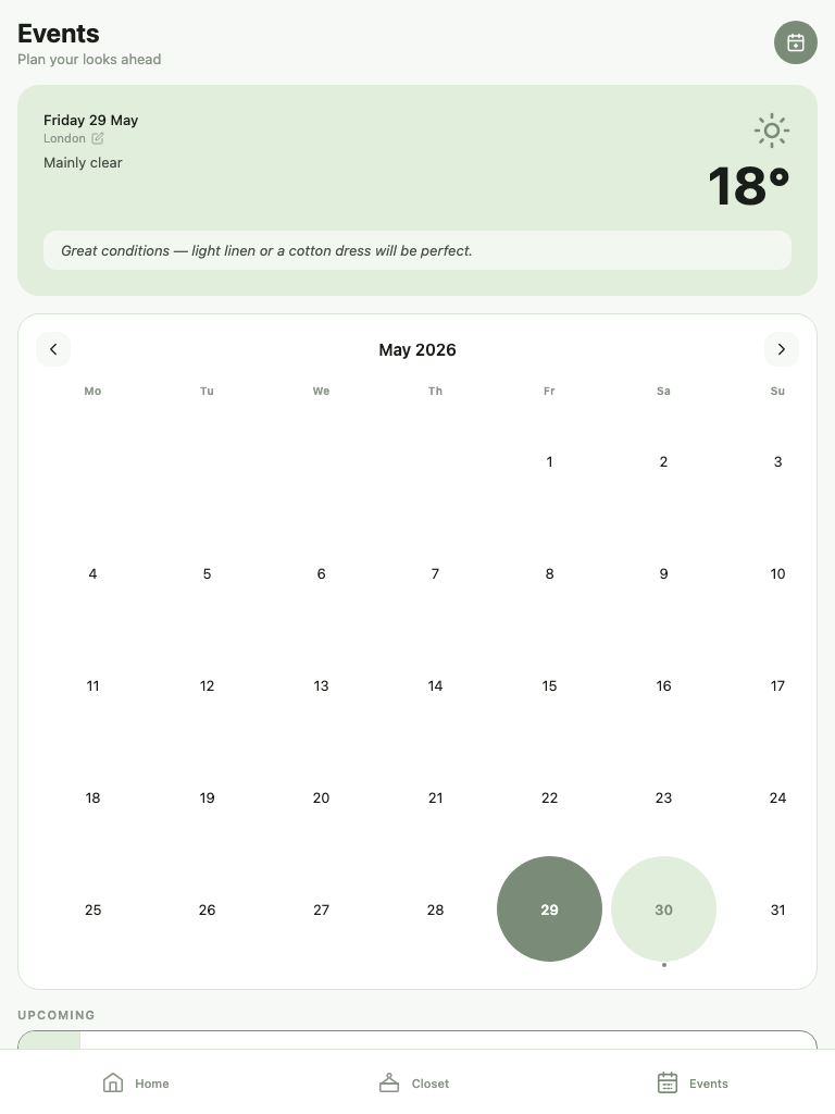
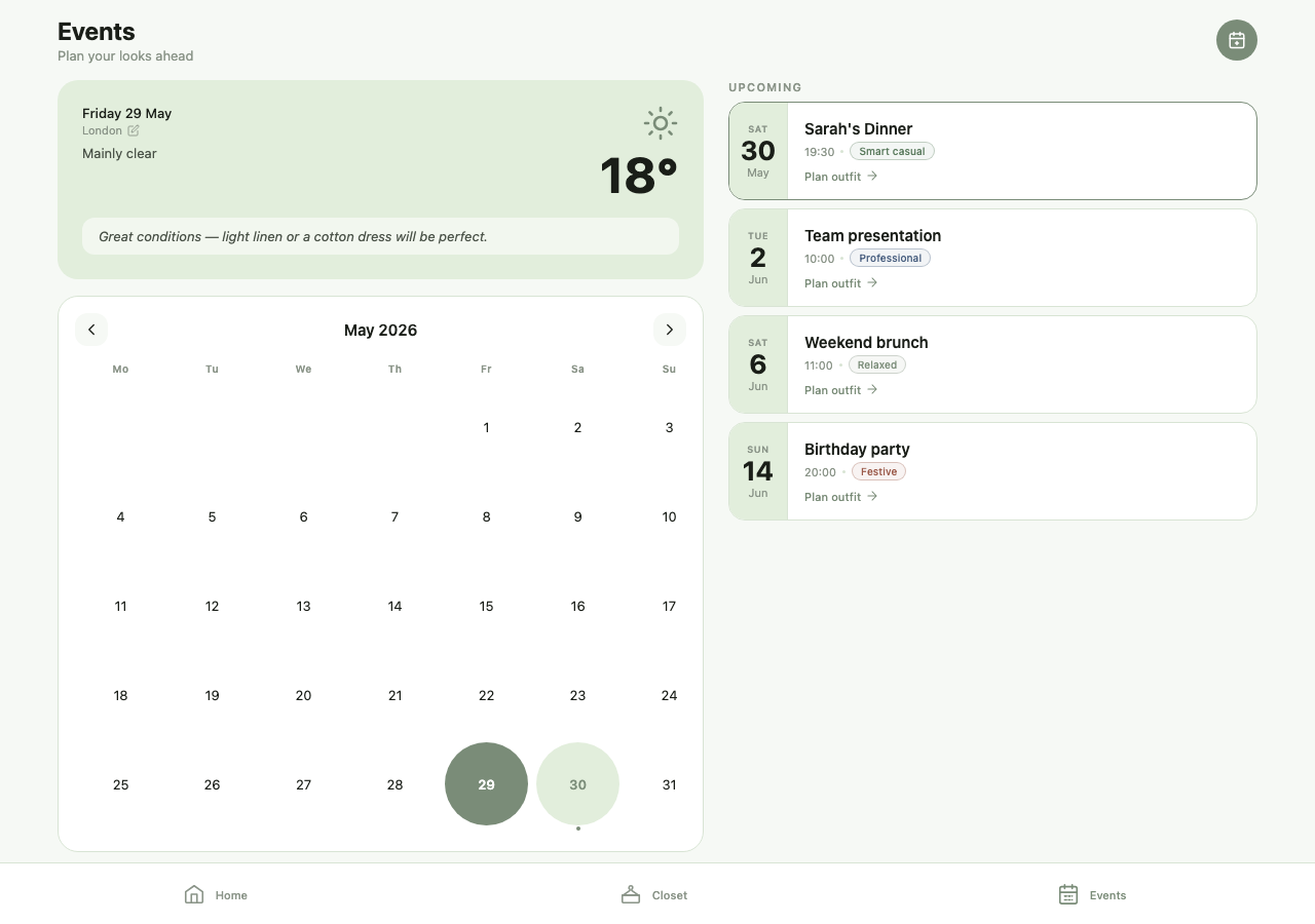
Dress codes are shown as chips: Smart casual, Professional, Relaxed, Festive. The weather card carries a plain-language line - great conditions, light linen or a cotton dress will be perfect - which is where the stylist will eventually speak.
Welcome and sign-in
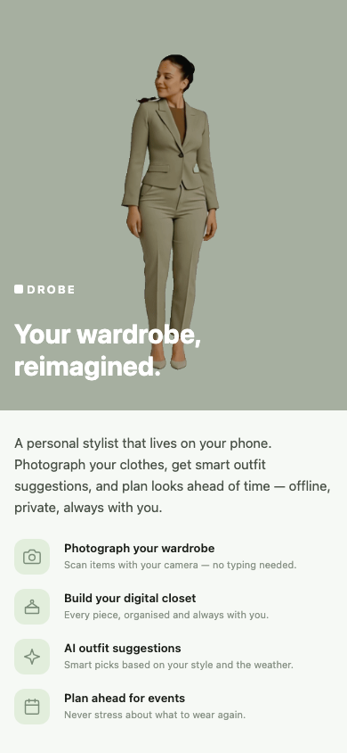
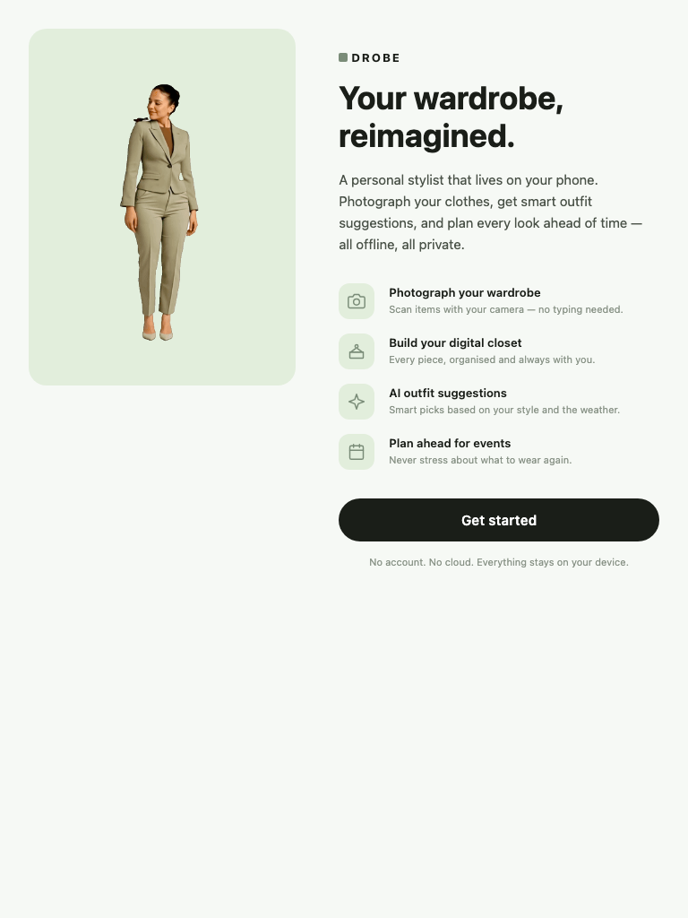
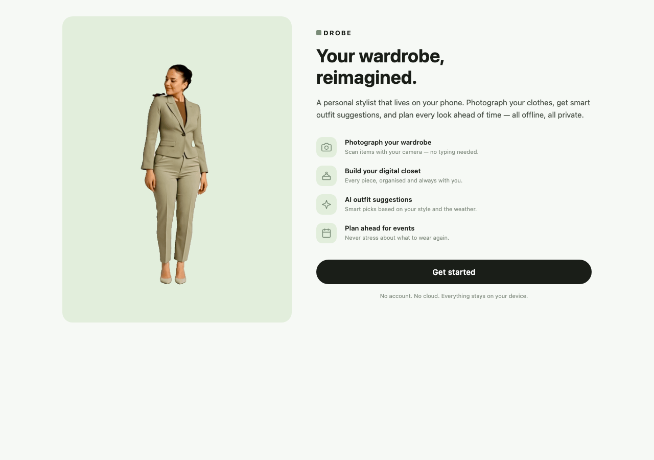
Sign-in takes a name and nothing else. There is no account, because there is no server.
What it is built on
| Framework | React Native via Expo SDK 53 - one codebase for iOS, Android and web |
| Routing | Expo Router, file-based |
| State | Zustand, persisted to AsyncStorage |
| Icons | Inline SVG, Lucide geometry. No icon font, no emoji |
| Storage | The device. No backend, no database, no cloud |
| Weather | Open-Meteo - free, no API key |